Introduction
In this worksheet, we will discuss how to change and customize scales and coordinate systems.
We will be using the R package tidyverse, which
includes ggplot() and related functions.
# load required library
library(tidyverse)
We will be working with three different datasets,
boxoffice, temperatures, and
tx_counties. You have already seen the first two
previously.
The boxoffice dataset contains box-office gross results
for Dec. 22-24, 2017.
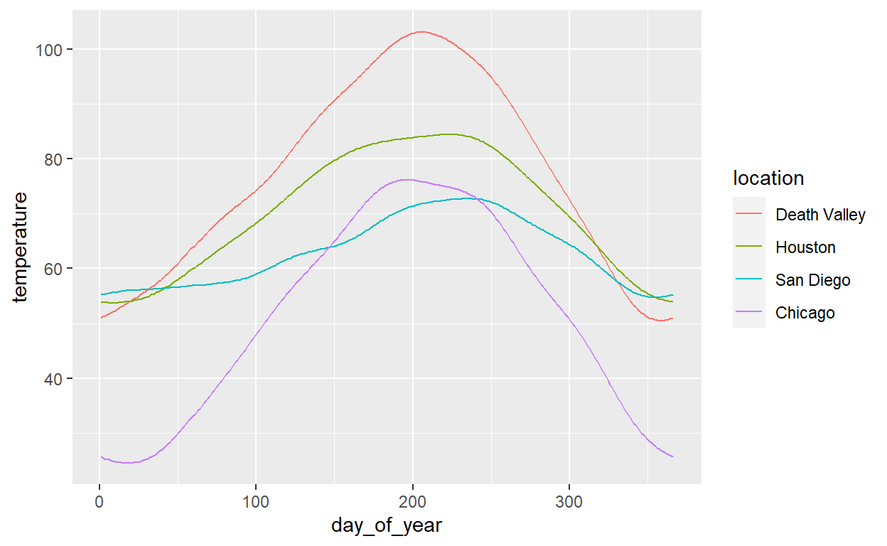
boxofficeThe temperatures dataset contains the average
temperature for each day of the year for four different locations.
temperaturesThe tx_counties dataset holds information about how many
people lived in Texas counties in 2010. The column popratio
is the ratio of the number of inhabitants to the median across all
counties, and the column index simply counts the counties
from most populous to least populous.
tx_countiesScale customizations
We can modify the appearance of the x and y axis with scale
functions. All scale functions have name of the form
scale_aesthetic_type(),
where aesthetic stands for an aesthetic to which
we’re mapping data (e.g., x, y,
color, fill, etc), and
type stands for the specific type of the scale.
What scale types are available depends on both the aesthetic and the
data.
Here, we only consider position scales, which are scales for the
x and y aesthetics. The most commonly used
scales types for position scales are continuous for
continuous data and discrete for discrete data, yielding
the scale functions scale_x_continuous(),
scale_y_continuous(), scale_x_discrete(), and
scale_y_discrete(). But there are others, such as
date, time, or binned. You can
look them up here: https://ggplot2.tidyverse.org/reference/index.html#section-scales
Position scale functions are used to modify both the appearance of the axis (axis title, axis labels, number and location of breaks, etc.) and the mapping from data to position (including the range of data values considered, i.e., axis limits, and whether the data should be transformed, as is the case in log scales).
Let’s start with this plot of the boxoffice data:
ggplot(boxoffice) +
  aes(amount, fct_reorder(title, amount)) +
  geom_col()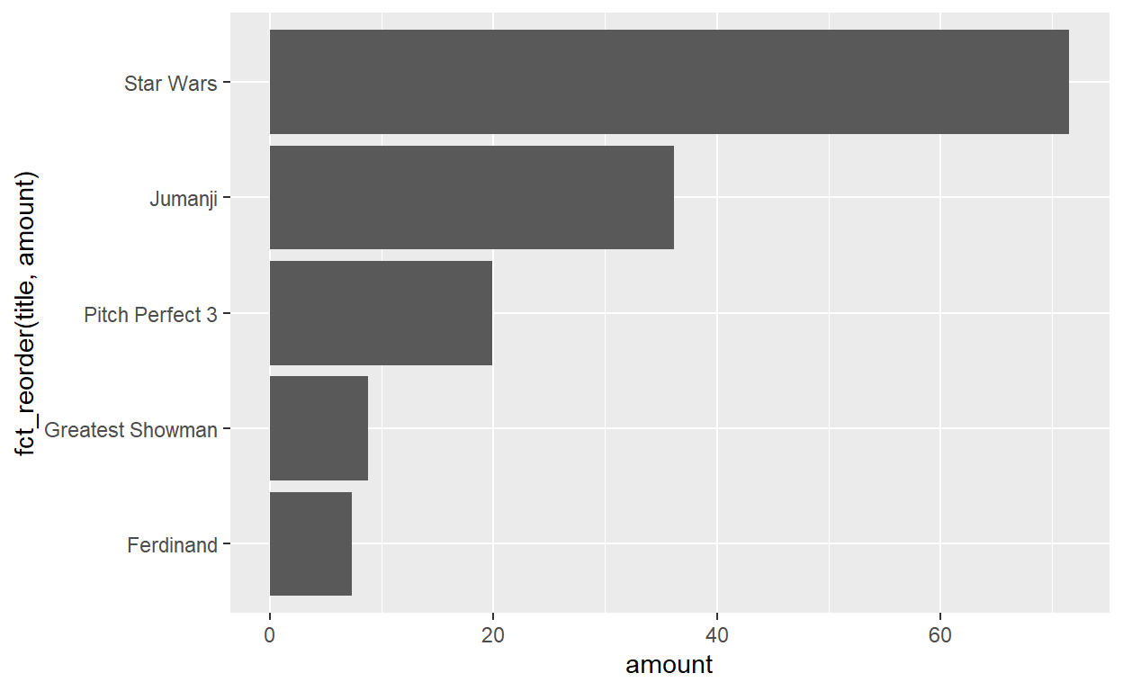
We can use scale functions to modify the axis titles, by setting the
name argument. For example,
scale_x_continuous(name = "the x value") would set the axis
title to “the x value” in a continuous scale along the x axis.
Use the appropriate scale functions to modify both axis titles in the above plot. Think about which axes (if any) are continuous and which are discrete.
ggplot(boxoffice) +
  aes(amount, fct_reorder(title, amount)) +
  geom_col() +
  scale_x____() +
  scale_y____()
ggplot(boxoffice) +
aes(amount, fct_reorder(title, amount)) +
geom_col() +
scale_x_continuous(___) +
scale_y_discrete(___)ggplot(boxoffice) +
aes(amount, fct_reorder(title, amount)) +
geom_col() +
scale_x_continuous(name = "weekend gross (million USD)") +
scale_y_discrete(name = NULL)We can also use scale functions to set axis limits, via the
limits argument. For continuous scales, the
limits argument takes a vector of two numbers representing
the lower and upper limit. For example, limits = c(0, 80)
would indicate an axis that runs from 0 to 80. For discrete scales, the
limits argument takes a vector of all the categories that should be
shown, in the order in which they should be shown.
Try this out by setting a limit from 0 to 80 on the x axis.
ggplot(boxoffice) +
  aes(amount, fct_reorder(title, amount)) +
  geom_col() +
  scale_x_continuous(
    name = "weekend gross (million USD)",
    limits = ___
  ) +
  scale_y_discrete(name = NULL)
ggplot(boxoffice) +
aes(amount, fct_reorder(title, amount)) +
geom_col() +
scale_x_continuous(
name = "weekend gross (million USD)",
limits = c(0, 80)
) +
scale_y_discrete(name = NULL)What happens if you set the axis limits such that not all data points can be shown, for example an upper limit of 65 rather than 80? Do you understand why?
(Hint: Scale limits are applied before the plot is drawn, and data points outside the scale limits are discarded. If this is not what you want, there’s an alternative way of setting limits. See the very end of this worksheet under “Coords”.)
Next, we can use the breaks and labels
arguments to customize which axis ticks are shown and how they are
labeled. In general, you need exactly as many breaks as labels. If you
define only breaks but not labels then labels are automatically
generated from the breaks.
In the above example, set breaks at 0, 25, 50, and 75, and format the labels such that they can be read as currency. For example, write $25M instead of just 25.
ggplot(boxoffice) +
  aes(amount, fct_reorder(title, amount)) +
  geom_col() +
  scale_x_continuous(
    name = "weekend gross",
    limits = c(0, 80),
    breaks = ___,
    labels = ___
  ) +
  scale_y_discrete(name = NULL)
ggplot(boxoffice) +
aes(amount, fct_reorder(title, amount)) +
geom_col() +
scale_x_continuous(
name = "weekend gross",
limits = c(0, 80),
breaks = c(0, 25, 50, 75),
labels = c("0", "$25M", "$50M", "$75M")
) +
scale_y_discrete(name = NULL)When looking at the previous plot, you may notice that the x axis
extends beyond the limits you have set. This happens because by default
ggplot scales expand the axis range by a small amount. You can set the
axis expansion via the expand parameter. Setting the
expansion can be a bit tricky, because we can set expansion at either
end of a scale and we can define both additive and multiplicative
expansion. (Additive expansion adds a fixed value, whereas
multiplicative expansion adds a multiple of the scale range. ggplot uses
additive expansion for discrete scales and multiplicative expansion for
continuous scales, but you can use either for either scale.)
The simplest way to define expansions is with the
expansion() function, which takes arguments
mult for multiplicative expansion and add for
additive expansion. Either takes a vector of two values, indicating
expansion at the lower and upper end, respectively. Thus,
expansion(mult = c(0, 0.1)) indicates multiplicative
expansion of 0% at the lower end and 10% at the upper end, whereas
expansion(add = c(2, 2)) indicates additive expansion of 2
units at either end of the scale.
Try this yourself. Use the expand argument to remove the
gap to the left of 0 on the x axis.
ggplot(boxoffice) +
  aes(amount, fct_reorder(title, amount)) +
  geom_col() +
  scale_x_continuous(
    name = "weekend gross",
    limits = c(0, 80),
    breaks = c(0, 25, 50, 75),
    labels = c("0", "$25M", "$50M", "$75M"),
    expand = expansion(___)
  ) +
  scale_y_discrete(name = NULL)
ggplot(boxoffice) +
aes(amount, fct_reorder(title, amount)) +
geom_col() +
scale_x_continuous(
name = "weekend gross",
limits = c(0, 80),
breaks = c(0, 25, 50, 75),
labels = c("0", "$25M", "$50M", "$75M"),
expand = expansion(mult = c(0, 0.06))
) +
scale_y_discrete(name = NULL)Try different settings for the expand argument. Try both
multiplicative and additive expansions. Apply different expansions to
the y axis as well.
Logarithmic scales
Scales can also transform the data before plotting. For example, log
scales such as scale_x_log10() and
scale_y_log10() log-transform the data. To try this out,
we’ll be working with the tx_counties dataset:
ggplot(tx_counties) +
  aes(x = index, y = popratio) +
  geom_point()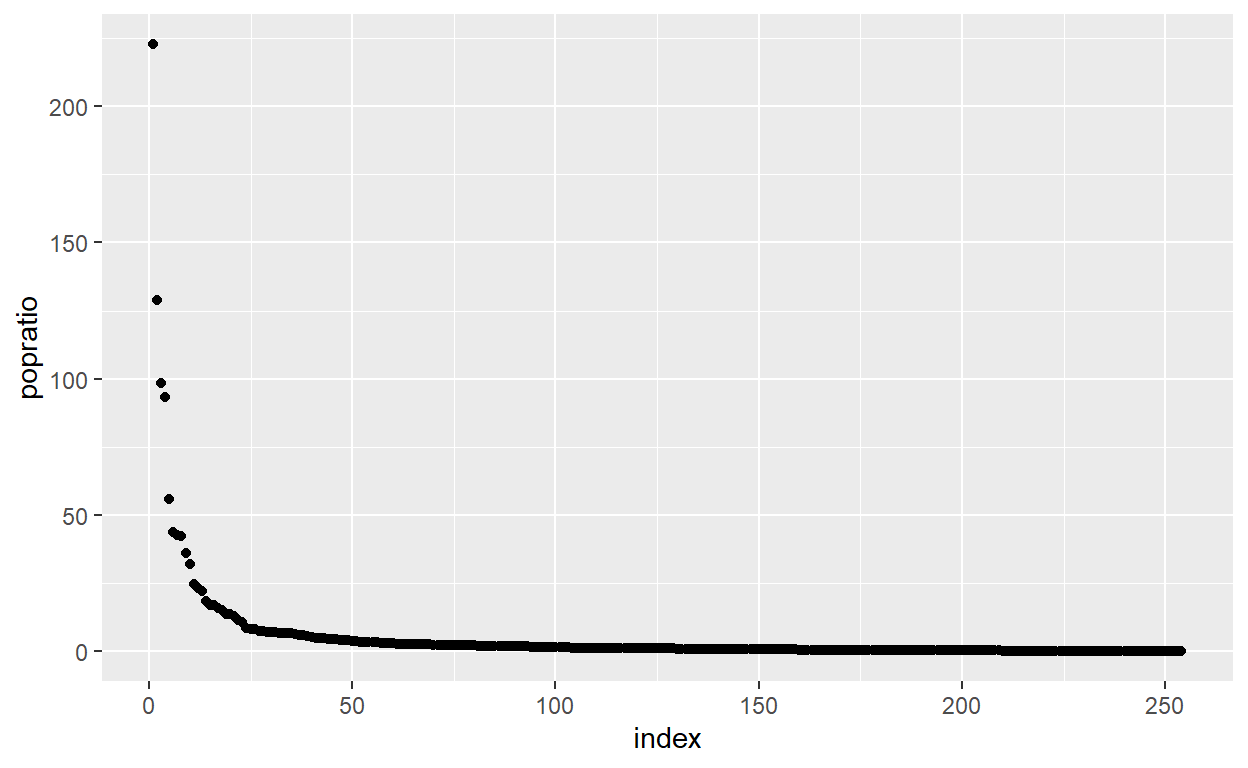
Modify this plot so the y axis uses a log scale.
ggplot(tx_counties) +
  aes(x = index, y = popratio) +
  geom_point() +
  ___
ggplot(tx_counties) +
aes(x = index, y = popratio) +
geom_point() +
scale_y_log10()Now customize the log scale by setting name,
limits, breaks, and labels. These
work exactly as they did in scale_x_continuous().
ggplot(tx_counties) +
  aes(x = index, y = popratio) +
  geom_point() +
  scale_y_log10(
    name = ___,
    limits = ___,
    breaks = ___,
    labels = ___
  )
ggplot(tx_counties) +
aes(x = index, y = popratio) +
geom_point() +
scale_y_log10(
name = "population number / median",
limits = c(0.003, 300),
breaks = c(0.01, 1, 100),
labels = c("0.01", "1", "100")
)Coords
While scales determine how data values are mapped and represented along one dimension, e.g. the x or the y axis, coordinate systems define how these dimensions are projected onto the 2d plot surface. The default coordinate system is the Cartesian coordinate system, which uses orthogonal x and y axes. In the following example, I have added the coord explicitly, but this is not normally necessary.
 We can however add a different coord, for example
coord_polar() to use a polar coordinate system. Try this
out.
ggplot(temperatures, aes(day_of_year, temperature, color = location)) +
  geom_line() +
  coord_polar()
In the polar coordinate system, the y axis (here, temperature) is
mapped onto the radius, and the x axis (here, day of year) is mapped
onto the angle. You can use scale_x_continuous() and
scale_y_continuous() to modify the radial and angular axes.
For example, you may want to change the temperature limits from 0 to 105
so the temperature curve for Chicago doesn’t hit the exact center of the
plot. Try this out.
ggplot(temperatures, aes(day_of_year, temperature, color = location)) +
  geom_line() +
  coord_polar() +
  scale_y_continuous(limits = ___)
ggplot(temperatures, aes(day_of_year, temperature, color = location)) +
geom_line() +
coord_polar() +
scale_y_continuous(limits = c(0, 105))There are other useful coords. For example,
coord_fixed() is a Cartesian coordinate system with fixed
aspect ratio. This is useful when we plot variables along the x and y
axes that are measured in the same units. In this case, we want the two
axes to be coordinated, such that one step along x has the same meaning
as one step along y.
To demonstrate this, reshape the temperatures dataset
into wide format, and then plot temperatures in San Diego versus
temperatures in Houston.
temps_wide <- temperatures %>%
  pivot_wider(names_from = location, values_from = temperature)

head(temps_wide)
ggplot(temps_wide, aes(`San Diego`, Houston)) +
geom_point()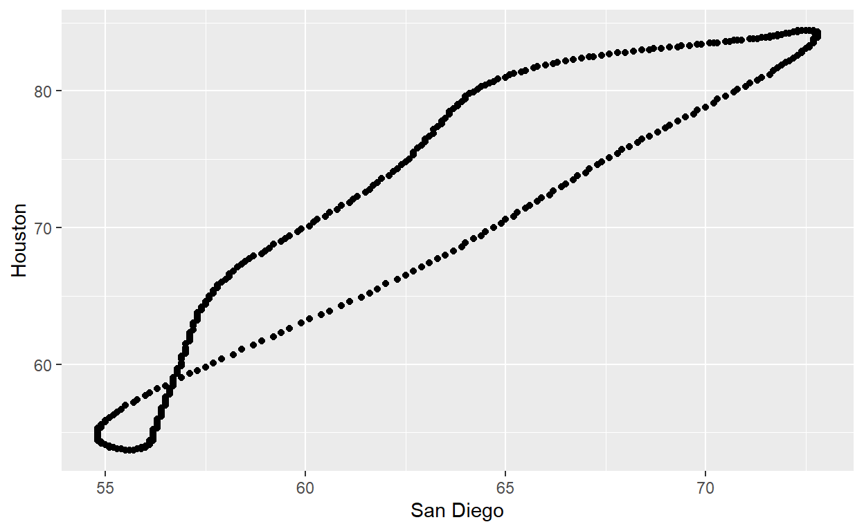
Units along both x and y are temperatures, but a 10 degree difference
in Houston is shown as a shorter distance than a 10 degree difference in
San Diego. To address this problem, add coord_fixed() to
the above plot.
ggplot(temps_wide, aes(`San Diego`, Houston)) +
geom_point() +
coord_fixed()This plot is technically correct but it doesn’t look good, because breaks are spaced differently along the two axes. Also, the plot looks strangely narrow and tall. We can fix both issues by manually setting breaks and limits for both axes. Try this out.
ggplot(temps_wide, aes(`San Diego`, Houston)) +
  geom_point() +
coord_fixed() +
scale_x_continuous(
limits = ___,
breaks = ___
) +
scale_y_continuous(
limits = ___,
breaks = ___
)ggplot(temps_wide, aes(`San Diego`, Houston)) +
geom_point() +
coord_fixed() +
scale_x_continuous(
limits = c(45, 85),
breaks = c(40, 50, 60, 70, 80)
) +
scale_y_continuous(
limits = c(48, 88),
breaks = c(50, 60, 70, 80)
)Finally, as the last example of what can be done with coords, we go
back to the problem of setting limits on the box-office bar plot.
Instead of setting limits with scale functions, we can also set them via
the arguments xlim and ylim inside the coord,
for example here coord_cartesian(). (This would be a good
reason to explicity add coord_cartesian() to a plot.) When
we set limits in the coord ggplot does not discard any data points.
Instead it simply zooms in or out according to the limits set. Try this
out by setting the x limits from 10 to 65 in the box-office plot.
ggplot(boxoffice) +
  aes(amount, fct_reorder(title, amount)) +
  geom_col() +
  ___
ggplot(boxoffice) +
aes(amount, fct_reorder(title, amount)) +
geom_col() +
coord_cartesian(
xlim = ___
)ggplot(boxoffice) +
aes(amount, fct_reorder(title, amount)) +
geom_col() +
coord_cartesian(
xlim = c(10, 65)
)Note: It is normally not a good idea to start a bar plot at a value other than 0. The previous exercise was solely to demonstrate how limits in coords differ from limits in scales.